THE PROBLEM
Many places offer recommendations for food and nightlife but what about local businesses and services? How do you choose if there’s a good doctor, electrician or salon nearby and set up an appointment with them?
Instead of wasting time calling multiple locations trying to set up an appointment, how can we connect young professionals with local businesses that have availabilities that match their schedules?
Book it aims to allow people who have busy and hectic schedules to only view the business options that have availabilities when they need it and where they need it.
Search
Navigate
Book It
USER INTERVIEWS
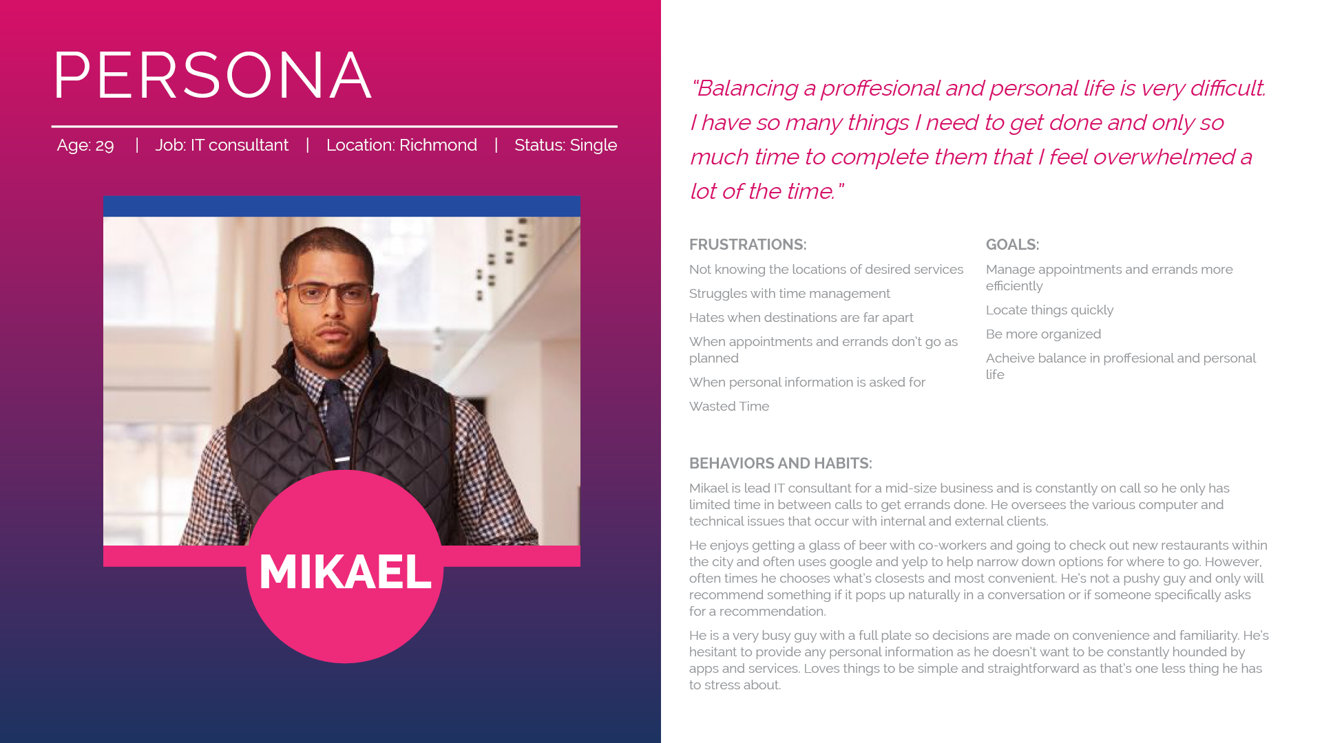
The discovery phase was a quick, high-intensity effort that allowed us to define project milestones, competitive analysis and user needs, behaviors and pain-points. Our research revealed 3 main points that informed the development of persona types.
Point 1
All users use Google or Yelp to help find businesses and narrow down choices based off of recommendations.
Point 2
Users primarily chose businesses based off of closest vicinity and most recognizable brand.
Point 3
Most users stopped the search process if prompted for personal information before being able to view results.
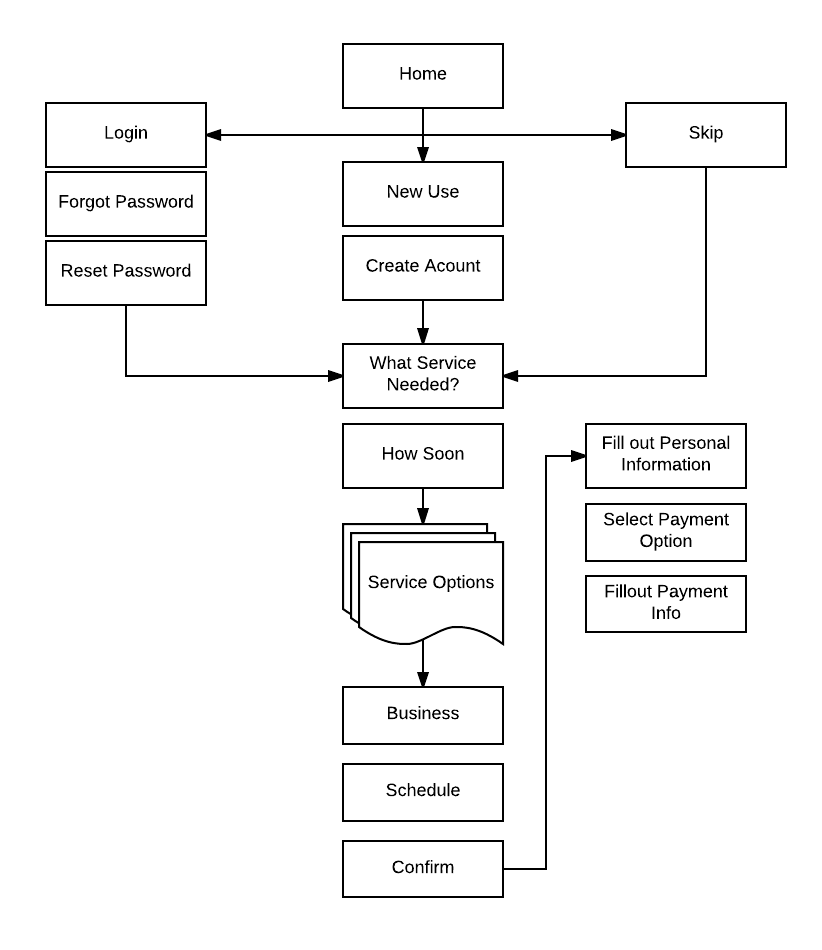
USER FLOW
Using experience mapping techniques to visualize and communicate the users end-to-end experience. This allowed us to represent pain points of possible user fatigue and focus our attention.

Initial Design Direction
Based on the user flow, initial sketches and storyboards were generated on various ideas about the arrangement of UI, functional and data elements, and interactive behaviors. Starting broad, our vision began evolving into something tangible. The early sketched were created exploring the different navigation patterns for the app’s intended interface.
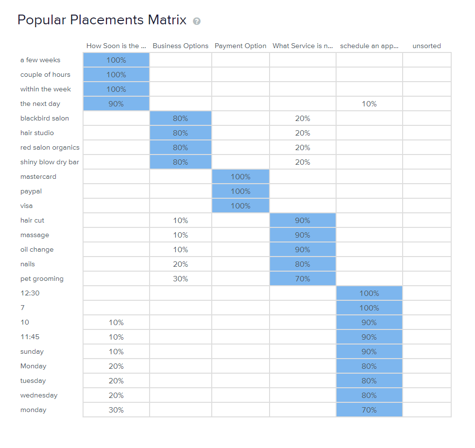
STRUCTURING THE EXPERIENCE
Card sorting was used to determine if the organization categories were in tune with user needs. After receiving the results I realized the menu options needed to be more clear and distinct from each other for users to differentiate between them clearly.
Card Sorting Results
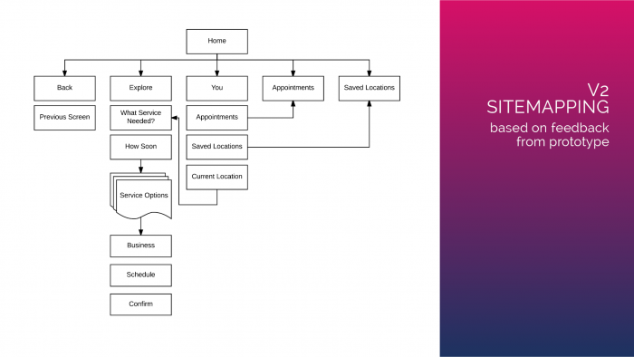
Site Map V1
FEATURES
Simplicity is Key
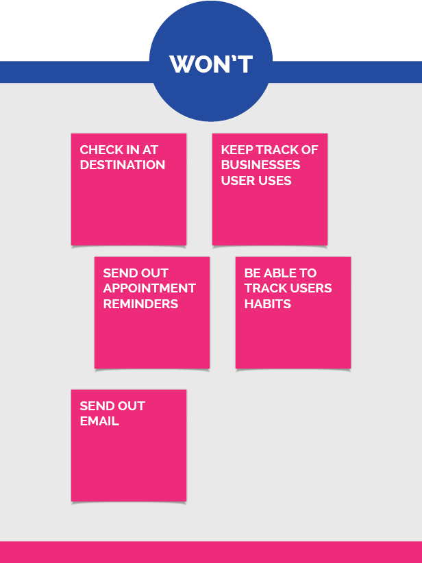
Combing through our research and user pain-points, we focused on prioritizing features based on our personas needs, tech feasibility, and business objectives. To further simplify the functionality and content we categorized what features were necessary, what opportunities were available to innovate and what could be discarded from the app. This informed our phasing strategy for the app and the product feature roadmap.


Feedback
FLOW
Users found the flow to be relatively easy but that the confirmation screen should happen immediately after booking the appointment instead of the payment option. Also, onboarding is necessary for new users.
TONE AND VOICE
Some of the text was not clear as to what it was prompting the user to do in some areas or that certain text needed to be moved around in order to flow more smoothly.
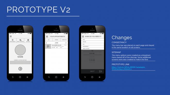
CONSISTENCY
For a smoother transition for booking the appointment, selecting the date, and confirming, it’s good to have the buttons be in the same location and be closer to the thumb for users to swipe.

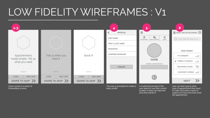

Low Fidelity Mock-Ups
All of the feedback resulted in the development of some low fidelity wireframes that contained onboarding screens, sample text for search examples and maintained consistency with button placement.
Prototyping and Usability Testing
Using InVision, a prototype was created for user testing, creating transparency in our design process. Through multiple iterations and revisions, we worked collaboratively, tested constantly and iterated progressively based off of user feedback.
DEVOLPING THE BRAND
Creating a Visual Identity
The logo and slogan were created based off of the key phrase in the user interface, the Book It button. Book It was witty, upbeat, organized and honest.
Tone and Voice
Tone and Voice
Keeping the key elements of our persona in mind, we struggled with developing the right tone and voice. We wanted to maintain a witty, upbeat, but organized and honest experience.
The Name
The Name
The logo name was created based off of the key phrase in the user interface, the Book it button. Book It embodied the tone and voice perfectly: witty, upbeat, simple and honest.
Tag Line
Tag Line
We focused on the primary goal of the app, which was to minimize frustration and save time. “It’s about time” can be construed as both a statement of frustration or a statement on the primary focus of the app, time.
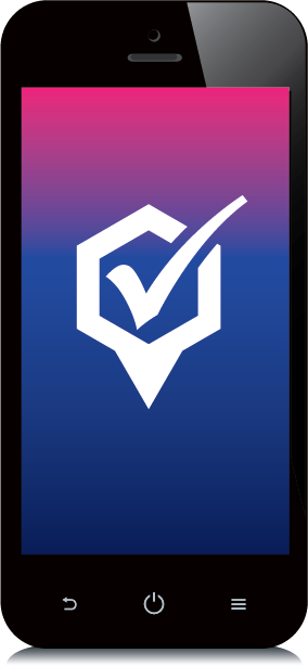
Icon
Icon
Brainstorming and sketching resulted in the icon and color scheme. The icon reflects the mood of the name, playing with task and location themes to create a fun cohesive design.
INTRODUCING BOOK IT
Detailed Design
Book It is a mobile app that assists busy young professionals in finding the right appointments to fit their busy schedules. Users can enter keywords based on the services required and filter the hundreds of options to the one most convenient to them.


